As someone from outside the USA, I’m surprised a state flag looks this good. I dig it.
There has been a recent movement of states with bad flags trying to improve their image. Illinois might be next and I’m quite excited about it as it’s long overdue!
I thought, “Doesn’t Illinois have one of the few good state flags?”
Nope, I was thinking of the city flag of Chicago. The state flag is literally just the state crest on a white background. It would absolutely benefit from a redesign. :p
There’s actually a few nice ones. Check out New Mexico, one of my personal favourites.
I think NM is ok, but we Coloradoans fuckin’ LOVE our flag.
Best looking flag to ever be on a Subaru.
…new mexico’s current flag is one of the very best, and certainly beats the heck out of their laughable first effort…
Wow that’s… different
It’s no California Bear, but it’s up there
The bear is great but the fact that they label it “CALIFORNIA” in big block letters makes me laugh every time I see it. It’s like a child drawing.
https://lemmy.world/comment/8300053
All good things in America should be treated with suspicion
It’s not uncommon to have religious symbolism in flags. 🇦🇨🇦🇫🇧🇲🇦🇺🇦🇮🇧🇻🇮🇪🇬🇧🇸🇦🇫🇮🇫🇴🇸🇪🇮🇶🏴🏴
Just a quick glance through flag emojis for some.
Love that someone downvoted this
Probably for implying that “we’re going to conquer the world for our religion that was specifically racist until 2013 and abolish the separation of church and state” is the same thing as a cross or moon.
Wait until you hear about Islam 🇮🇶🇸🇦
I’m gonna be real with you chief, of all the things you can accuse fundamentalist Muslims of racism isn’t really one them (the faith actually demands anti-racism… For the Faithful TM), and everything else they do Mormons can match.
Weird hangups about drugs? Yup.
Patriarchal polygamy? Yeppers.
Wanting to establish a global theocracy? You know it.
Weirdly obsessed with a desert city? Damn skippy.
So, idk, seems like a pretty clear victor there on the checklist. Anti-racism zealotry is better than specifically racist zealotry.
Also, just saying, a Muslim has never tried to convert me door to door.
The faith isn’t racist. You just have to do Arab rituals, wear Arab clothing, pray in Arabic, and the only proper way to read the Qur’an is if you know Arabic. Oh and also make a pilgrimage to Arabia.
Although I do concede that Mormonism is worse with the fabrication that the mark of cain is upon non white people, and that Islam doesn’t really call for discrimination against other races.
we’re going to conquer the world for our religion that was specifically racist until 2013
It’s still plenty racist.
abolish the separation of church and state
In Utah, its functionally non-existent. You don’t win city dog catcher if the electorate thinks you’re somehow anti-Mormon. You won’t be appointed to anything, either.
the same thing as a cross or moon
Go back to when those flags were originally stitched up and you’re going to find evangelical views remarkably similar to that of modern Mormons. Religious supremacy is at the heart of virtually every major surviving world religion. Putting a big cross on your flag and going out to conquer your religious rivals goes back to Constantine the Great.
It absolutely means the same thing.
The beehive isn’t the significant religious symbol to Latter-day Saints that you think it is. Those of us not from Utah barely know about the symbol’s relationship to the history of the Church.
I just watched CGP Grey’s video about state flags yesterday
He’s a Colorado hater though.
Lol he stuck to his “no name on the flag” rule but I recall him saying it was decent. Im from IL so I cant complain about bad flags
He did say no names or words and Colorado’s flag has a letter on it. I would argue that doesn’t fall within the criteria he laid out but oh well.
I see it as C and O which is the shorthand name for the state 🤷♂️
Tbf, it does look a bit like a corporate logo
CGP is wrong here
…i mean, if rwanda’s 1962 flag didn’t give you a case of the giggles, i guess colorado’s alright…
This video from about a year ago mentions that and I find it convincing: https://piped.video/watch?v=fzUDKYOQ_g0
Now I will admit that I’m a CGP Grey fan and thus biased, but I do think this rebuttal does feel more contrarian than reasoned.
He mentions the historical use of flags was for easy recognition at sea and in war and thus not really needed by established land-locked colonies, but I’d argue recognizability is still the main purpose of flags. I’d actually argue it’s more important now since we see so many more flags in our lifetime than anyone did 200 years ago. How often do you see states listed by or next to their flags now? Take this Wikipedia article on state populations. Do you need the flags to identify each state? Of course not. But they do enforce instant recognition of the state and make it easier to find the state you care about at a glance (so long as the state has a distinct flag).
Beyond that, he mentions the historical meaning of seals, but that need not be lost by a flag redesign. Take the proposal for the Keystone Flag, which reuses the colors of the seal while adding new meaning via symbolism. Both can be used as conversation points to teach about the history of the state, while the latter gains the benefit of being visually distinct.
He also mentions that the point of seals was to be visually intricate not because of the history they represent, but for security purposes. Why, then, do we need what is basically a watermark on our flag? Does it trump the desire for a visually appealing and meaningful flag just because it’s old?
As a final point, Grey has a practical reason for desiring distinct flags: he uses them to visually represent states and countries in his videos. His preference, biased as it may be by his own needs, is not arbitrarily decided.
“more contrarian than reasoned” is like J.J.'s brand.
I, on the other hand, am biased against CGP Grey, but I take your point that he didn’t arbitrarily arrive at his opinion. I do find the seals visually distinct myself but I can see it the other way.
oh man I forgot about JJ for a bit there
I still can’t believe they tried to stop this from being adopted because better designs are woke now apparently
Look, let’s be honest. Any change is “woke.” There is this imaginary world that existed 80 years ago that they want to get back to, that was all sunshine and surplus, and they think that any change, particularly progressive change, is bad and “woke.”
Edit: so I realized what instance I was in and that this isn’t the appropriate place for that rant. So I will just say that I really appreciate the changes that are being made to flags, because it seems like the people coming up with the flags in the first place didn’t really get it.
I do like that they took “hexagons are the bestagons” to heart.
Legendary refrence.
Looks like an nfl team logo. I hate how contemporary corporate design it is.
You think that’s bad, check out some of the municipal flags in Japan, especially the ones designed in the early 2000s. The ones based on old clan symbols are fine, but those other ones look like some corpo bro from the 90s commissioned designs by saying “I want it to have more radical swoosh vibes!”
https://en.wikipedia.org/wiki/List_of_municipal_flags_of_Tōhoku_region
Hirosaki not changing theirs is… interesting.
I guess Buddhism is still common enough in Asia that WWII didn’t completely ruin the manji. You still see temples marked on maps with it these days.
The Nazis stole that symbol from Buddhism.
And Hinduism…
Hirosaki not changing theirs is… interesting.
[David Herman as Michael Bolton with the flag of Hirosaki superimposed over his face]
“Why should we change? They’re the ones who suck.”
Some of those must have been straight up inspirations for Star Wars. Looking at you Hachinoche and Kamikita.
Those ones are probably based on historic clan emblems
Still better than the state seal on a flag
I see Star Wars, the Klingons, a mirrored Swastika, Harry Potter, and a few others in there.
This one makes me think of an airline.
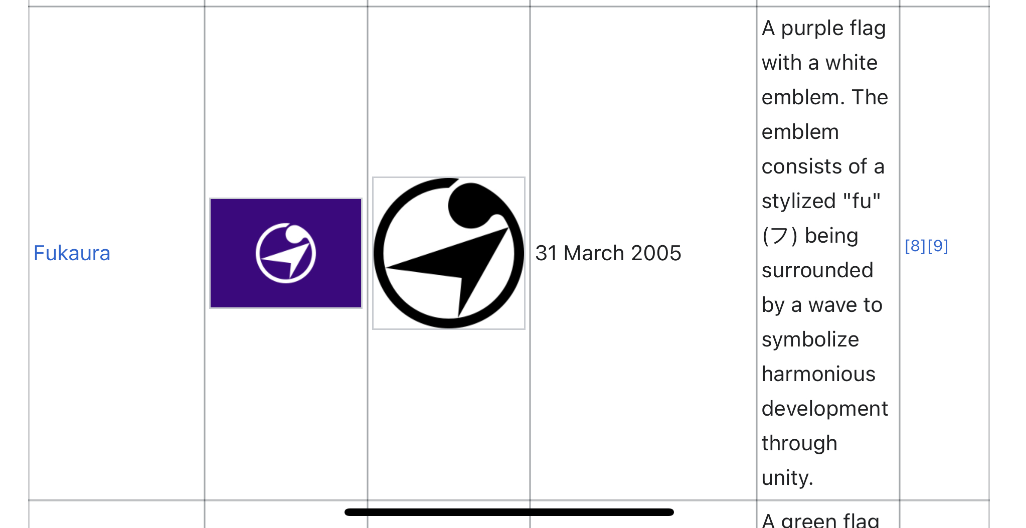
That’s funny because that place is pretty deep in the boonies, about a 2 hr drive from the nearest airport.
Weird, it doesn’t feel corporate at all to me. A flat, simple design doesn’t immediately mean something’s corporate.
I don’t have any art background so I can’t really describe why the (non-clan based ones) feel so overly artificial. I think the color choice has a lot to do with it though-- way too many lime greens and oranges for me. Plus some of them are based on letters from the latin alphabet, which almost seems like a reverse weeb thing, ie “western letters are so cool guys!” Not that most of the kana ones are much better-- it’s hard to make lettering on a flag look good.
Maybe the vexillology community would be able to describe it better.
edit: I mistook the comment I replied to as a reply to my comment below, but I’ll leave this up as an explanation into why I find the Japanese flags strange
I can see where you’re coming from (in regards to Japanese prefecture flags) but I still think a lot of them look really good. At least the nicest thing is that they’re all consistent, but still a bit distinct from each other. And a symbol on a blanket is waaaay better than the american seal on a blanket in my opinion :)
Contemporary corporate is extremely fitting to the Mormon majority.
I don’t hate it. Mountains and bees. Two things I love.
deleted by creator
…alaska’s one of the good state flags, don’t give them any ideas!..
Don’t miss the valley
The valley’s for low lifes
Is there alot of bees there?
Since you haven’t received a serious answer yet…
Utah is self reffered to as the Beehive State because Brigham Young originally wanted to name it “Deseret” from the Book of Mormon. “Deseret” in LDS teachings means “Honeybee”. This was meant to show that the Mormon settlers were hardworking, industrious, and self reliant.
This obviously didn’t fly for a ton of reasons and they didn’t have much of a choice after the Union Army basically chased them halfway across the country and then took a foothold right alongside them in the territory to make sure they didn’t establish a Theocratic state.
to make sure they didn’t establish a Theocratic state.
Another Big L for the US military
US military v theocratic state in the desert, name a more iconic duo.
US Military collaborating with a theocratic state in the desert?
Wait, you support a theocratic state?
Have you been to Utah? It is a theocracy.
I must visit this Utah.
As a resident of Utah, I fucking better if I’m running for an elected office
Doesn’t article 6 of the constitution atleast allude to a separation of church and state?
I don’t think the rest of the federation would approve of a theocratic state.
Except Texas, Mississippi, Alabama, Missouri, Tennessee, Kentucky, West Virginia, Oklahoma, Kansas. But other than that what have the Romans ever done for us?
All highly religious states yet, none that are truly theocratic states. They all follow article 6 of the constitution and try their best to tailor their laws to subvert it. Ultimately the federation wins.
Doesn’t article 6 of the constitution at least allude to a separation of church and state?
Sure. But it doesn’t preclude candidates from announcing their religious affiliation and voters selecting them accordingly.
I don’t think the rest of the federation would approve of a theocratic state.
Not a Mormon theocratic state (which is one big reason why Romney underperformed Bush and Trump among Evangelicals). But there’s a sizable portion of the population that would like their flavor of religion as de facto law of the land. And quite a few who assert it already is, and its just a matter of an Executive/Judiciary action to make it a reality.
Which I simply don’t understand.
I’m religious, but if following the tenants of my faith were law, I would no longer be choosing to practice my faith.
The US (and western civilization) has been a theocratic state for a long time, it simply hides in plain sight as scientism or materialism.
Hate to break it to you, but one of the two major political parties in this country is.
Wait it’s actually to do with Mormonism? Wild
Wow never was going to figure that out by looking at it.
Deseret
Ether 2:3 And they did also carry with them deseret, which, by interpretation, is a honey bee; and thus they did carry with them swarms of bees, and all manner of that which was upon the face of the land, seeds of every kind.
NOT THE BEEES!!!
Hive mind?
As someone who used to live there, that’s exactly what I thought too!
is utah known for beekeeping or something?
When settlers first got to Utah they imported bees and brought them in to help develop and cultivate. Since then, Utah has been known as the beehive state.
That would be a logical reason for it but remember this is Utah… so no.
Bees have weird place in Mormon lore. The creepy founder created a new name for them in the Book of Mormon “Deseret”.
His successor, Brigham Young, used it as the name of country Mormons tried to establish in the west.
“It represents a theocracy ruled by the church.”
The bee symbolism used in sermons from the 1850s described the godly society the Saints strove to build.
https://byustudies.byu.edu/article/the-symbolism-of-the-beehive-in-latter-day-saint-tradition/
Wow. That is nuts.
I had the “Symbols of Manchester” Wikipedia page at the ready to make the point that a bee is a fairly well-known symnbol of industry, but as they say, truth is stranger than fiction.
that makes sense. thanks for the utah lore
deleted by creator
Beehive, pooping a star…
Better then most states
Which is a bar that sadly one is endanger of tripping over
The bar is too low to be a trip hazard.
looks like colorado envy to me…haha
It’s well designed, nice shapes and colours
They’ve flattened the Disney logo
It’s lovely. Unlike the compromise flag that came out of Minnesota.
You’re looking at the Minnesota flag through the eyes of someone with lots of good choices who didn’t get what they want. I think there’s no doubt that the current new flag is an upgrade from the old one.
It’s an upgrade. But the bar was already low because the previous flag was pitiful. The one that won he competition was fine, but then someone (or someones) who thought they “knew better” made changes to it and sucked all the color out of it. Now it’s just meh.
Imo the new Minnesota flag is great. It’s not as good as the original submission (and that sentiment might contribute to people not liking it as much), but it’s still a good flag. The colors are nice, the design is distinct & readable, and you can even combine other flags with it (an obvious example being a pride flag) by replacing that light blue field.
WOW that’s way better!


