• 1 Post
  • 13 Comments
Joined 4 years ago
cake
Cake day: June 7th, 2020

help-circle


  • rxxrc@lemmy.mlto196@lemmy.blahaj.zonePoorly socialized rule
    link
    fedilink
    arrow-up
    38
    arrow-down
    1
    ·
    3 months ago

    Are we really so far down the “obligatory memetic envelope because apparently just stating opinions isn’t socially acceptable any more” slope that we’ve dropped past “can’t stop thinking about x lmao” and on to “i was talking to my sister and, get this, i said x”?


  • This is honestly quite mild by website bloat standards. If that’s really the entirety of their Javascript it’s already way smaller than e.g. Medium or what this blog post considers “slightly bloated”. The fact that it’s in one file in 13 lines is also very standard. It makes no difference to the parser whether there are newlines or not, and removing them will in fact be saving bytes.

    I’m guessing the performance issues with the site are more to do with how it’s coded. If it’s really bad for what sounds like a simple use case it might even be a cryptominer or something. A lot of those “random utility as a service” sites are.


  • I’m a bit too young to really remember a time before CSS, but I wholeheartedly agree with you on the growth of websites needing a mess of convoluted Javascript just to load/construct what is essentially static content. The idea of both CSS and JS is that they should be used for progressive enhancement – take a good starting HTML webpage, make it prettier with CSS, then make it even prettier with JS. But in practice people just build React apps and the like, that show nothing unless you enable Javascript. (Even Lemmy-UI sadly succumbs to this; it should be perfectly possible to enable most forms of interaction on this site with plain old HTML forms.)

    Again I agree with you on dark themes, but for screenshots that’s a user problem, I don’t think there’s much Mozilla can do about that. FWIW I’m using Dark Background and Light Text which has an “invert” option that’s generally pretty successful even when style-based approaches fail. (But it goes out of its way to not invert images, so you still get those blaring Twitter screenshots.)

    I think I actually remember being frustrated by Firefox’s handling of broken images in the past, so really we agree about pretty much everything haha. I have a user CSS style for Lemmy that sets a min width and a border for images even when they’re broken, but that should absolutely not be necessary of course.

    The last part of the CommonMark page is an exercise! It’s giving you a challenge: to add alt text to the image. “SHOW HINT” is giving you a hint. So I definitely don’t think it’s encouraging you to not add the alt text; quite the opposite.

    CommonMark is not in alpha. It’s a specification for Markdown, which is a kind of text formatting that’s been around since 2004. There were a bunch of differing implementations of it, so CommonMark was created as a standard. (Variants of) Markdown are used on Reddit, Github, Discord, and in comments in the Rust programming language, among many other places. But alt text itself is not even a Markdown thing – it’s part of HTML, and has been since 1993. It has its own Wikipedia page and everything.

    Markdown compiles to HTML, so Markdown has a way to specify alt attributes, and Lemmy uses Markdown for message formatting, so Lemmy transitively also has a way to specify alt attributes. Both of these are good things, because alt text is a web standard that is widely recommended for accessibility reasons.

    To your point on welcoming people into the Fediverse, sure, there is definitely a lot more that could be done there. I haven’t used Mastodon much, but I believe they have a more user friendly UI for adding alt text to images, that encourages you to do so and explains why. Maybe something similar will eventually come to Lemmy as well.


  • rxxrc@lemmy.mltomemes@lemmy.worldHow's your anus doing?
    link
    fedilink
    English
    arrow-up
    1
    ·
    edit-2
    9 months ago

    Alt text is a well-established mechanism for making images accessible – not so much in the case that they don’t load, but for screen readers and other accessibility tools. I agree it would be nice to have some easy way of viewing alt text if I want to (there are probably browser extensions out there?), but just because it doesn’t work like that currently, doesn’t mean you shouldn’t use it. It works fine for its intended purpose (again, screen readers).

    Your link describing inconsistent browser support is from 13 years ago, I have to assume it’s gotten better since then.

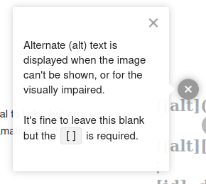
    As for the markdown syntax, any good markdown reference should explain alt text (it’s a widely used standard, nothing to do with Lemmy being in alpha). Your link to the CommonMark tutorial has it right there (granted, behind a nondescript floating button, which is a questionable design choice if you ask me):

    Text box containing the text "Alternate (alt) text is displayed when the image can't be show, or for the visually impaired. It's fine to leave this blank but the  is required".

    Here’s how I embedded the image above:

    ![Text box containing the text "Alternate (alt) text is displayed when the image can't be shown, or for the visually impaired. It's fine to leave this blank but the `[]` is required".](https://lemmy.ml/pictrs/image/d9fb19c0-5e60-4f96-9225-a36809031ef2.png)
    

    This is helpful for anyone using a screen reader, who would otherwise have no idea what the image showed.


    abandoning it altogether and finding an open-source solution

    Is Firefox not open-source?