

Lol - ya, location makes a difference. I am now also curious what that is supposed to represent. I looked on their website but since I don’t have an account all I could see was mostly marketing and sales info. There was a FAQ about that feature with a youtube video that might explain the data points but the video opened with a 2.5 minute ad so I bailed… can’t believe there are 3rd party adds on a video from a company’s help section! The iOS app store lists the rut map/forecast as a feature but that’s it. The app does look pretty sweet though - I’ll have to tell my brother about it.
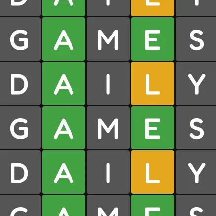


Wordle 1,234 4/6
⬛⬛⬛⬛⬛
⬛⬛⬛⬛⬛
⬛🟩🟩⬛🟨
🟩🟩🟩🟩🟩
Wasn’t off to a good start today but it all worked out