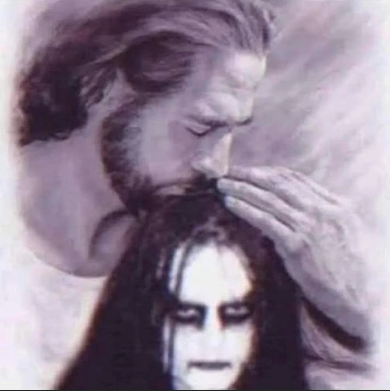
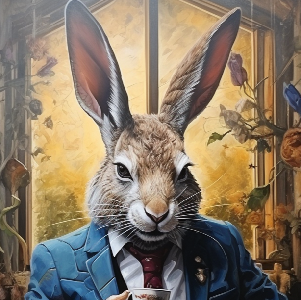
If anybody can suggest what it should look like I can try feeding my AI as I have loads of credits left :)
I have no idea what it should look like. Absolutely no idea… “A banner for a diverse group of gay bros”?
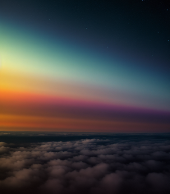
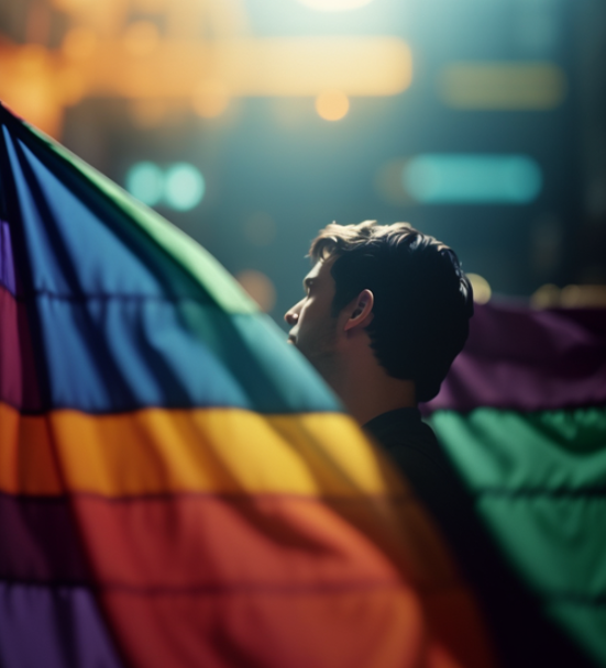
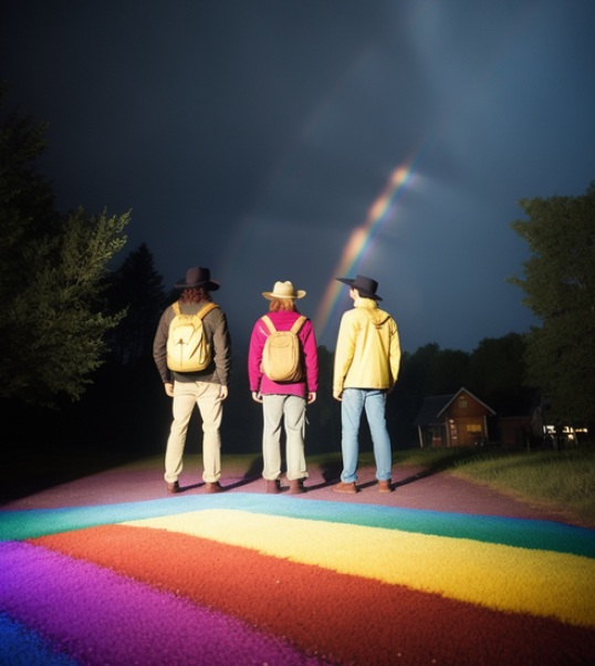

Something like this maybe?? If yes, let me know which one and I can see if I can somehow transform it into a banner
This is not quite what I had in mind… I was hoping for something more… artistry? Though, honestly, I don´t know what…
But this should not be a decision made by me guys… This community is for you. We have 350 subscribers. Please, start posting and commenting.
I really like the lighting in the second photo.
I had a go at a couple of ideas, I ended up getting really carried away with the idea of kawaii aubergines though…
hum… Let’s see what the community says. Though I find the first ones a bit too… much. Too feminine, not that there is anything wrong with that… The last ones, I dunno… Is there any relation between that fruit and gays?
Yeah the first ones are a bit rainbowy I agree, it seems to come up when you put ‘gay’ into AI art generators though lol.
I mean there is a whole thing with 🍆 and 🍑 emojis which is where I was going with the last ones.
While I love the first two for their almost psychedelic quality, I don’t know that they fit here for a banner. But I’d love to see them…somewhere. They have almost a gamer quality to them.
Yeah I was just throwing ideas out there to see what fit, think we’ve gone with something different.
I like the second one most and yeah it does have some video game feel to it!
-
Here’s some other attempts, a bit less rainbow this time 😊
I made the 1st one the banner of the sub. It looks good I think! What do you think? There is just one thing I don’t like: The white background, between the faces… It ruins my dark theme aesthetic. Some sort of gray would be great, but for now it is good enough!
What do you think? Thank you!
Hooray! I’m glad we got one that looks okay.
I think it looks good and I do hear what you’re saying about the white, I’m on mobile right now and with the avatar having a white background I think it brings them together. If I have time I’ll see if I can do anything in photoshop though
I just saw this new banner, its great, really attractive and reflects that we’ll have guys from all over the world. Nice job
Thank you! All props to @Speckle@lemmy.world.
Thank you 🙏
I like this , but I see what you’re saying about the backgrounds. I think it would look great with transparent backgrounds so they’d blend in with the theme.
Yeah I realised after my last comment on this the logo has a transparent background. I’ll see if I can do anything about it if I get the time
-

