
Why did UI’s turn from practical to form over function?
E.g. Office 2003 vs Microsoft 365
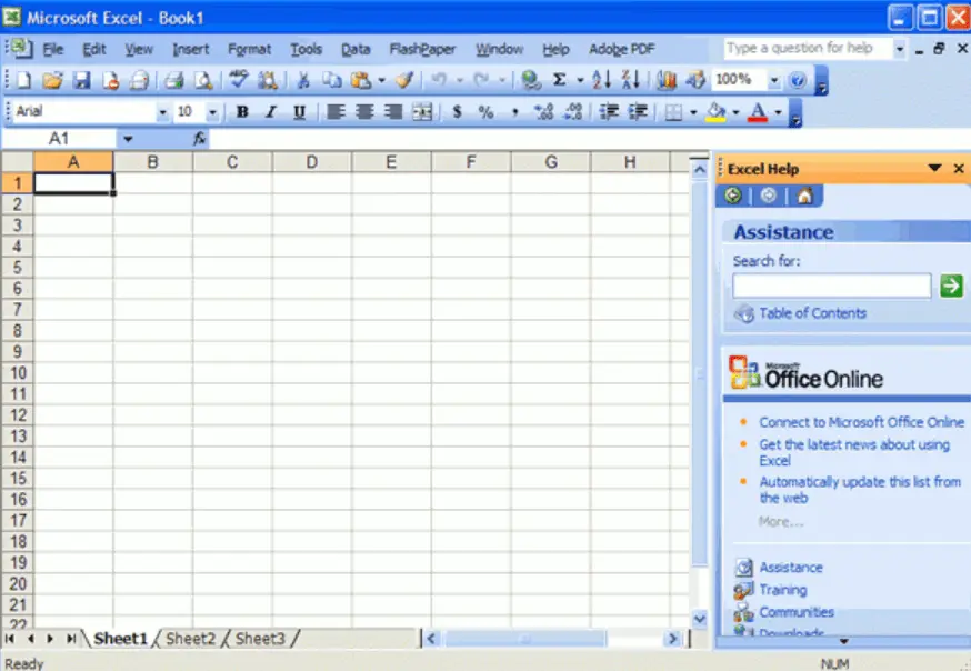
It’s easy to remember where everything is with a toolbar and menu bar, which allows access to any option in one click and hold move.
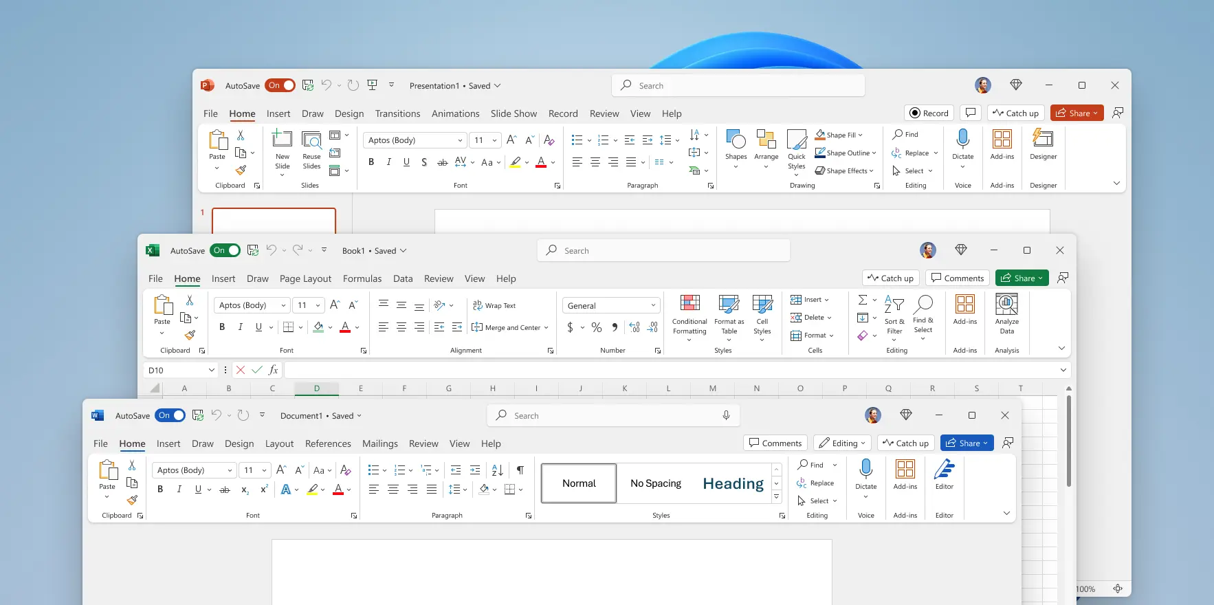
Seriously? Big ribbon and massive padding wasting space, as well as the ribbon being clunky to use.
Why did this happen?
Yes, actually—I have a VM reserved mostly for 16-bit software.
Yes, actually—the Windows machine I’m forced to use for work restores as much of that aesthetic as practical, sometimes with the help of third-party software. My main home machine features a Linux DE whose appearance is largely the same as it was circa 2005 and whose development team is dedicated to keeping that look and feel.
Some of us do put our money where our mouths are, although I admit that isn’t universal.
It’s true that some level of padding is necessary in a UI, but the amount present in contemporary design is way too large for a system using a traditional mouse or laptop touchpad, which are capable of small, precise movements. Touchscreen-friendly design is best saved for touchscreens, but people don’t want to do the work involved to create multiple styles of UI for different hardware. I’ve never encountered anything touted as “one size fits all”, whether it be a UI or a piece of clothing, that actually does fit everyone. At best, it’s “one size fits most”, and I’m usually outside the range of “most” the designers had in mind. At worst, it’s “lowest common denominator”, and that seems to be the best description for contemporary UI design.