
Why did UI’s turn from practical to form over function?
E.g. Office 2003 vs Microsoft 365
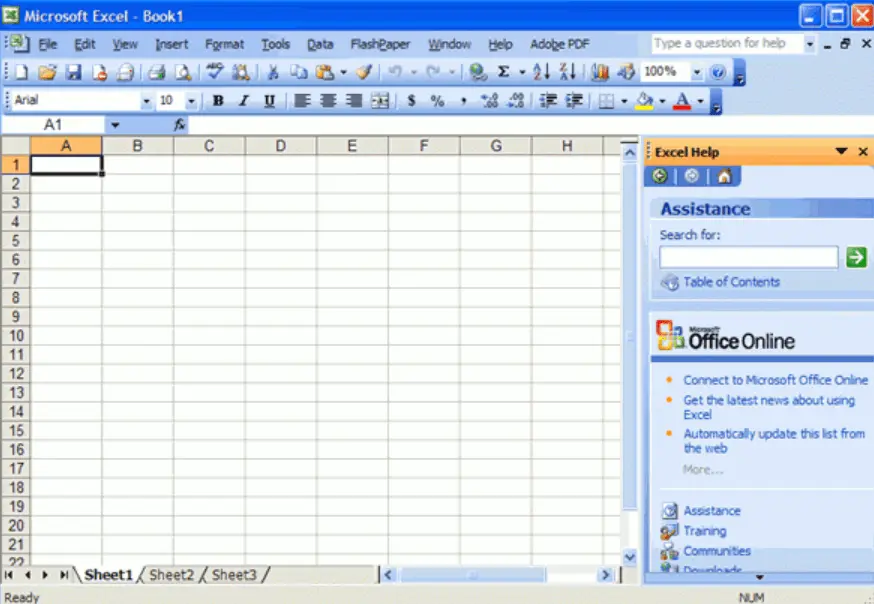
It’s easy to remember where everything is with a toolbar and menu bar, which allows access to any option in one click and hold move.
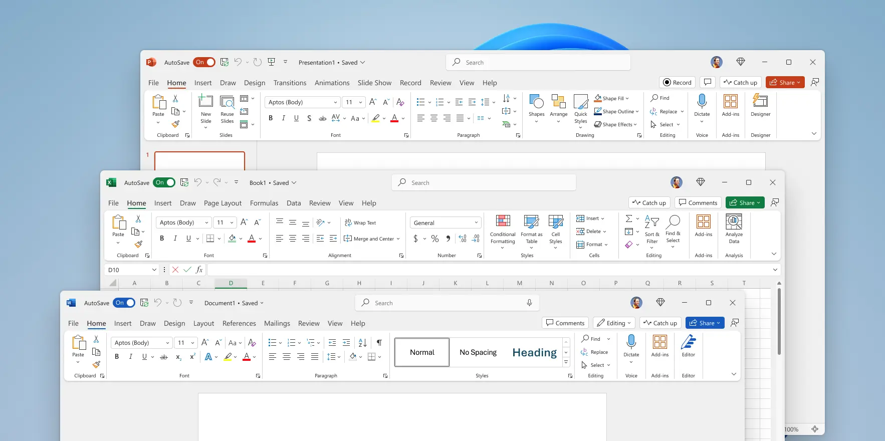
Seriously? Big ribbon and massive padding wasting space, as well as the ribbon being clunky to use.
Why did this happen?
I remember people being upset by the ribbon back when office 2007 was released. Their complaints made sense until I sat down and used it. Found it to be a great improvement. I switched my libre office to the ribbon layout as soon as they added it. Because I don’t use it often, it’s great for finding stuff compared to looking through the menus.
The nice thing about the LO implementation is also that they added a couple of varieties of the design, like the compact one which pushes things closer together so it’s not distracting.
It’s like having a robot vacuum. You’ll catch yourself saying “Why is it ALWAYS getting in my way??!” It’s not, it’s just that you only think about where it is when it’s in your way. When it’s not around you, you are thinking about other things.
UI is the same. People complain about any UI they actually stop to notice. If you know the UI well you don’t even really think about it, you just use it. When a UI changes you have to relearn a little bit and this causes people to have to stop and think about the UI.
99.99% of the time people seem to interpret this as “This UI objectively sucks! Any UI I need to think about must be terrible!”
But it’s not that hard to understand that a little relearning will follow change, and that things will have to change over time unless they were perfect forever out of the box, which nothing is.
But no. “The new update is horrible!” Every. Time. It’s so routine to UI designers that they totally ignore this feedback. So people really shouldn’t even bother to post it.