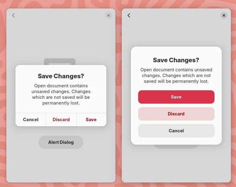
New GNOME dialog on the right:

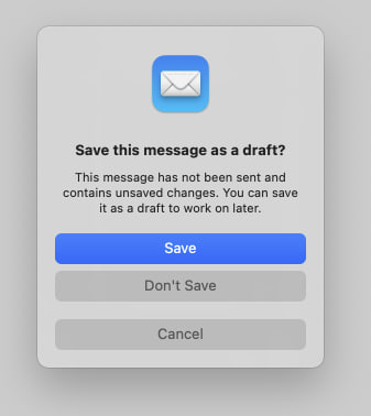
Apple’s dialog:

They say GNOME isn’t a copy of macOS but with time it has been getting really close. I don’t think this is a bad thing however they should just admit it and then put some real effort into cloning macOS instead of the crap they’re making right now.
Here’s the thing: Apple’s design you’ll find that they carefully included an extra margin between the “Don’t Save” and “Cancel” buttons. This avoid accidental clicks on the wrong button so that people don’t lose their work when they just want to click “Cancel”.
So much for the GNOME, vision and their expert usability team :P


Well, it’s insulting for people to lose their work because someone did a lousy UX job. :)
Cloning macOS should not be views as something “bad” because for what’s worth we all know Apple spends a LOT in usability research (they’re not as good as they used to be, but still better than the rest).
That’s the thing, I’ve basic design / UX training and all the literature on action buttons with dangerous effects tells you to add a margin. Any design undergraduate should also be able to notice that life saver as well… however the GNOME team totally missed it.
This isn’t the first time them failing at basic UX and they don’t like when people try to suggest improvements nor when they later on criticize them.
Just because you like apple doens’t mean that apple does a perfect job and GNOME should copy it. GNOME does a lot of thing better than apple. And microsoft also does a couple of things better than apple. Apple isn’t perfect and microsoft isn’t all bad
Yes, so let’s copy Apple and keep the few things GNOME does well.
Having used OS X, there is no way they’ve done usability testing. Doing basically everything is hard on OS X
This is an insane take based on absolutely nothing.