I think using better floss has really made this one look a lot cleaner than my previous projects!
She really is looking very neat! Possibly also just the effect of all the practise and experience though. I like the sort of flecky fabric too, it’s a nice contrast with the flat colours.
I have had a super disrupted week after husband’s surgery last Wednesday, but been getting back to stitching the last couple of days. Here is a kind of confusing shot of the right side of my Steampunk World Map (all the little awkward bits down that side are new since last time), and a basic spoopy house silhouette I designed that needs to be finished by Friday but I accidentally watched a bad video while stitching on it and made myself motion sick 🤮

These are neat looking. Really like the spooky house so far.
Thanks! It’s cute and I like it on the orange linen but need to let my stomach settle a bit before I can face working on it more 😂
I love that steampunk map and I’m considering if I want to try it myself lol! The spooky house is looking good too despite the setbacks!
The fabric I used on this one is called “fiddlers cloth”. It was for sale with all the regular aida cloth at the fabric store so I thought I would try it out. It’s a bit more expensive than the regular cloth, but it’s stiffer and holds tension better which is really good for me! I thought it would look better than the plain green background in the pattern
If you do ever decide to try the map pattern, my main tip would be to pick a fabric where the weave isn’t super loose. Just…trust me on that one 😅
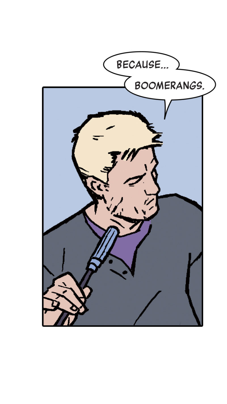
This is looking great. Really love the pop of the colors of the comic art.
Thanks! I think it will look even better with the big retro Wonder Woman logo that goes at the bottom!
@MrJameGumb @lemmy_stitch I’m back on the greenhouse to show for #wipwednesday . I added the potted plant and you can see the silhouette of Prof. Carver in there! I also started another #CrossStitch project. What is it? Time will tell. All I can say is that I suck at gridding and I already messed it up…
Derp. I guess mastodon uploads don’t carry over to Lemmy. Ah well.


p.s. the greenhouse is looking fantastic and that guy on the left is incredibly creepy 😂
deleted by creator
The garden still looks amazing! I can’t wait to see who the mysterious figure on the left is! I did not know gridding was a thing, so you are doing better at it than I am lol! I love the colors on the new design though!
And just to complicate matters further, images in comments here don’t show up on Mastodon either!
If you’re making a top-level toot on Mastodon and cross-posting it here, the first image in the toot will become the post image here. But that’s sadly about it image-wise, so best to only use cross-posting when you’re only expecting text replies 😆
Yeaaah… live and learn! I wanted to experiment because looking things up is no fun. Also tooting @ a community from Mastodon creates all sorts of weird formatting in the title when viewed from Lemmy. It would be amazing if there was more cross-compatibility.
Also the creepy guy will become much less creepy when finished. He was another amazing scientist that I had never heard of until now. George Washington Carver!
@IoSapsai The title thing happens because Lemmy takes the first line of your toot as the post title. So if you just put the first sentence on its own, and do your community tagging separately, it’s totally fine.
I have also experimented extensively, lol.


