

Hey feel free free to destroy this space game I have been working on for a while. Please say what you think even if it’s horrible .It will be helpful!! And welcome to this new nice community. Where we share HONEST feedback of videogames. There is also a free prologue to download.
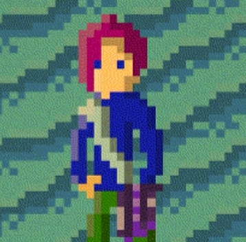
The games header on steam looks very amateurish with washed out colours and inconsistent art mixing pixel art logo and non pixelated art. The hair and face of the character also give the game sort of deviantart fanartish vibe making it very off-putting at least for me.
Looking at the screenshots I am almost immediately greeted by ugly repetitive tile-maps constructed by using same overly detailed yet seamless tile over and over again. Maybe look in to games like Stardew valley, Final fantasy pixel remasters, Suikoden and many more to see how they handle large fields of grass, sand or rocky terrain without making them too distracting.
The graphics also look very flat and while shadows help a little with this not all objects seem to have them. Some structures, objects and characters are also so bright and colourful compared to the terrain that they look like they emit light rather than block or reflect it making them really look out of place and inconsistent. Especially interiors seem to be really bright lacking almost any shadow.
As for gameplay it looks fine for most part with maybe space battles looking like they could be somewhat a struggle with ships moving so fast (in the trailer it looks like the player misses all his shots).