Some more info and the reasoning behind design decisions.
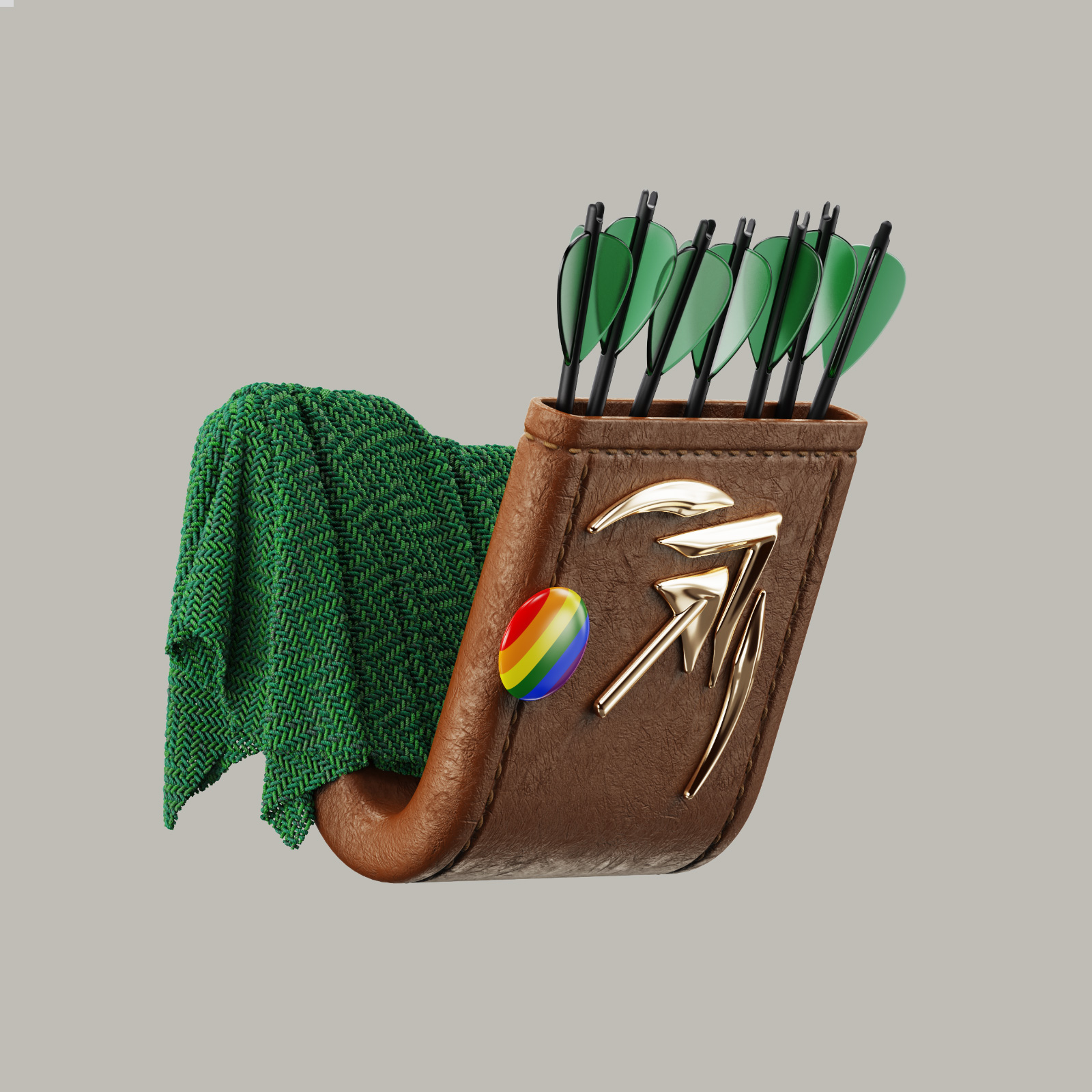
Artemis’ quiver is a reworked Artemis’ kbin community icon, but while that icon had 7 arrows for good luck, this one has five — for future five stars in the App Store :)
Stellar siblings is called that because the stars on the background are taken from a region in the night sky that includes the Lyra constellation — one that is associated with Apollo, Artemis’ brother. Larger stars are from the constellation itself, while smaller ones are those visible around the constellation. All the stars are carefully placed using stellar maps, so what you see on the icon should pretty closely resemble what you’d see irl if you can find Lyra.
Icon with stellar map overlaid
And Artebierre is just fun imo :) The name is a nod to Alcubierre drive, the fastest sci-fi-ish FTL drive (to get “to the moon”). Not completely sure about the nebula shape yet, and whether it should have more or less contrast in general.
A previous version and one other icon
Here’s an inline Stellar siblings image so you don’t have to click the link
Oh shit that quiver 🔥🔥
right?! LOVE THAT ONE.
These are coming with the next update!
Ooh I love the stellar siblings one! They’re all great though
is that a pickaxe?
A mix between a spaceship in front of a moon, bow and arrow/arrowhead, and an upvote, as far as I know.
But seriouly, reading that as a pickaxe gave me an image of uncharted territory, like venturing to the moon, Mars, or an online forum. I mean, just like that artemis. So maybe a mix of three, wonderful.
I guess that works as a metaphor as well :)


